


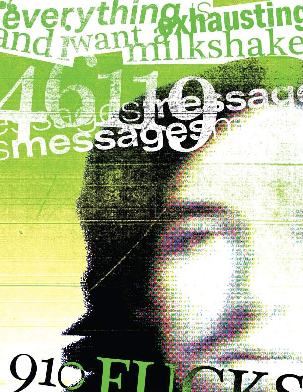


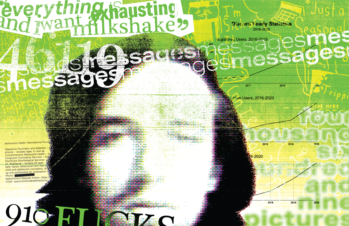
Produced in collaboration with Bud Rodecker, Design Director at Span Studio in Chicago, along with a group of my peers, we made two page spreads based on data we’d collected from our personal lives over the past year. This project marked my shift in personal style away from the clean, geometric student work I’d been making up until that point, and towards rougher, more 80’s punk-inspired design trends.


Croûton was a zine I made for a Publication Design class, and was my first real attempt at the style I like to call “netpunk”. The zine was based on the practice of—and my own personal thoughts on—the aesthetic of early 2000’s internet culture. Croûton also features the first appearance of “Zardogoth”, who I’ve since adapted as a de-facto mascot for my personal brand.
Netpunk has since become the core of my personal brand, as an experiment in what techniques such as image compression and ultra-saturation were capable of artisticially. It borrows the craftsmanship of analog techniques and changes it into a uniquely digital form, while still giving myself the freedom to express my ideas in the least restrictive way possible.
In case you missed it, you can check the whole thing out here.
When they announced that the Senior Capstone Showcase was going to be held online due to quarantine, the first thing I decided was that my project was going to make the most of that. From that idea came dead nuance, an experimental website which iterated on the ideas I’d laid out in Croûton. I used the framing device of a short personal narrative to experiment with image compression as both a textural and artistic technique, and how that might be used for other aspects of design.
